



Mastering Color Combinations: A Comprehensive Guide to Pairing Colors with Boutique Hotel Bedroom Furniture
Publish Time:
2026-08-03
How to Pair Colors with Boutique Hotel Bedroom Furniture
Creating a stunning and inviting environment in boutique hotel bedrooms hinges significantly on the choice of colors. Color not only influences the aesthetics of a space but also invokes emotions and sets the mood. Understanding how to pair colors effectively with boutique hotel bedroom furniture can enhance the overall guest experience, making it memorable and comfortable. This guide delves into the nuances of color pairing, providing a comprehensive approach to achieving a sophisticated look that resonates with your brand identity and appeals to your clientele.
The Importance of Color in Boutique Hotel Design
Color plays a pivotal role in interior design, particularly in boutique hotels, where unique guest experiences are paramount. A well-thought-out color scheme can:
- Influence Guest Mood: Colors can evoke various emotions; for example, blues and greens tend to create a calming environment, while yellows and oranges can energize a space.
- Enhance Brand Identity: Consistent use of color can reinforce a hotel’s branding, making it more recognizable and attractive to potential guests.
- Define Space: Thoughtful color combinations can help delineate different areas within the room, enhancing functionality while maintaining aesthetics.
Understanding Color Theory for Interior Design
Before diving into practical applications, it's essential to grasp the basics of color theory. This foundational knowledge aids in creating balanced and harmonious interiors.
Color Wheel Basics
The color wheel comprises primary, secondary, and tertiary colors. Understanding how these colors interact can guide your choices:
- Complementary Colors: Opposite colors on the wheel (e.g., blue and orange) create high contrast and vibrant looks.
- Analogous Colors: Colors next to each other (e.g., blue, teal, and green) provide a harmonious and serene palette.
- Triadic Colors: Using three colors evenly spaced around the wheel (e.g., red, yellow, blue) can create vibrant contrast while maintaining balance.
The Psychology of Color in Hospitality
Colors have psychological effects that can significantly impact a guest's impression of a hotel room. Understanding these effects can aid in selecting the right colors:
- Blues: Often associated with tranquility and reliability; great for creating calm spaces.
- Greens: Symbolizing nature, they promote relaxation and can refresh the room's ambiance.
- Reds: Energetic and passionate, reds can add warmth but should be used sparingly to avoid overwhelming guests.
- Yellows: Cheerful and inviting, yellow can brighten a space but may become overwhelming if overused.
Choosing a Color Palette for Boutique Hotel Bedrooms
Upon understanding color theory and psychology, the next step is selecting a color palette that resonates with your hotel's theme and target audience.
Assessing the Theme and Style
Your boutique hotel's theme—be it vintage, modern, minimalistic, or eclectic—will influence your color choices. Consider these approaches:
- Modern Aesthetic: Opt for neutral tones like whites, grays, and blacks, complemented by bold accent colors like teal or mustard.
- Vintage Charm: Soft pastels combined with deep jewel tones create an inviting yet sophisticated feel.
- Eclectic Style: Embrace vibrant colors and patterns, mixing complements and contrasts for a unique flair.
Creating a Balanced Color Scheme
A balanced color scheme typically comprises a primary color, a secondary color, and an accent color. Here’s how to choose them:
- Primary Color: This is the dominant color for walls and large furniture pieces. Choose a neutral tone that sets a calm foundation.
- Secondary Color: This color should complement the primary color and can be used for bedding or artwork.
- Accent Color: Use bold shades for accessories like cushions, rugs, and curtains to add vibrancy without overwhelming the space.
Practical Tips for Pairing Colors with Furniture
Once you’ve established a color palette, the next step is to effectively pair colors with the furniture in your boutique hotel bedrooms.
Matching Furniture Finishes and Colors
The finish of your furniture significantly impacts color perception. Here are some considerations:
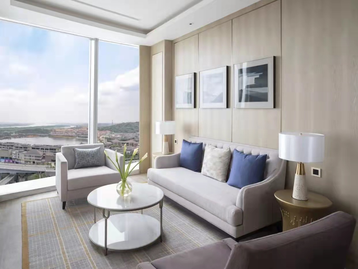
- Wood Finishes: Natural wood tones can warm up a room, pairing well with greens and creams.
- Metallic Accents: Gold or silver finishes can add elegance; consider pairing them with deep jewel tones for a luxury feel.
- Fabric Textures: Soft fabrics like velvet are excellent for a rich, warm palette, while cotton or linen can complement a fresh and airy scheme.
Layering Colors through Textiles
Textiles offer an excellent avenue for introducing color without overwhelming the design. Consider the following:
- Bedding: Choose bedding that incorporates your color palette, using patterns or textures to add depth.
- Curtains: Opt for curtains that enhance natural light while adding a pop of color in harmony with the overall scheme.
- Rugs: Area rugs can anchor a space, providing a foundation for the room’s color palette.
Integrating Artwork and Decor
Artwork and decor pieces can be instrumental in tying a room's color scheme together. Here’s how to effectively integrate them:
Selecting Artwork that Complements Your Palette
Artwork can introduce additional colors or provide a focal point. When selecting art, consider:
- Color Harmony: Choose pieces that echo the colors in your palette for seamless integration.
- Size and Scale: Ensure artwork is proportionate to the furniture and space to avoid a cluttered look.
Decor Elements that Enhance the Room's Theme
Incorporate decorative elements such as vases, lamps, and throw pillows that align with your color scheme:
- Vases and Plants: Adding greenery can soften hard edges while introducing natural hues.
- Lamps and Lighting: Opt for lamps that blend with or accentuate your color scheme, enhancing the ambiance.
Common Mistakes to Avoid in Color Pairing
While color pairing can be an enjoyable process, certain pitfalls can be detrimental to the overall aesthetic.
Overusing Bold Colors
While bold colors can be striking, overuse can create an overwhelming atmosphere. Reserve vibrant colors for accents rather than dominant features.
Ignoring Natural Light
Always consider the amount of natural light a room receives. Colors can look vastly different in varying lighting. Test paint colors and fabrics in natural light before committing.
Disregarding Guest Preferences
Understanding your target demographic is crucial. Opt for universally appealing colors that cater to your guests’ tastes while still reflecting your brand identity.
FAQs about Pairing Colors with Boutique Hotel Bedroom Furniture
What are the best colors for a boutique hotel bedroom?
Neutral tones like beige, gray, and white are popular, often paired with accent colors like teal, mustard, or deep reds to add warmth and personality.
How can I test color combinations effectively?
Use paint samples or swatches in the actual space to see how colors look under different lighting conditions throughout the day.
Can I mix different styles of furniture and still maintain a cohesive color scheme?
Yes, as long as the colors harmonize, mixing styles can create an eclectic and unique feel, enhancing the boutique experience.
What role does lighting play in color perception?
Lighting influences how colors appear. Natural light can soften colors, while artificial lighting can enhance or mute certain hues.
How often should I update the color scheme in boutique hotel bedrooms?
Consider refreshing your color scheme every few years or when making significant renovations to keep the space inviting and modern.
Conclusion
Pairing colors with boutique hotel bedroom furniture is a nuanced process that combines art and science. By understanding color theory, assessing your hotel's theme, and utilizing practical design tips, you can create a harmonious, inviting space that enhances guest experiences. Through thoughtful color choices, you can elevate your boutique hotel’s aesthetic, making it not just a place to stay but a memorable destination for all who enter.
Latest News
Online Message
*We will contact you as soon as possible after receiving your message!
Friendly Links: